

Thursday, December 15, 2011
Closing Post
This blog is now closed. We hope you enjoy looking around as much as we enjoyed the project itself!
Wednesday, December 14, 2011
Directors' Commentary
Once finished, we sat down to record a commentary on how some of the effects in the video were achieved and the reason we put certain shots there.
Audience Feedback: Survey
To recieve feedback from our audience, made a survey on Survey Monkey for our audience to fill out, and posted it on different social networking websites such as Facebook, Twitter and Tumblr.
The survey is live at http://www.surveymonkey.com/s/QPQSL96, and below is an image of all the questions:

By making a survey online as opposed to on paper at school, this meant that we could gain a larger reach, by sending the link to our YouTube video and survey to anyone we liked. It also meant that we could also contact the whole range of our target audience; especially the older end of the spectrum, as we're the oldest age group in our school.
Survey Monkey was also helpful as we could easily make bar charts of the collected data, as shown below. This particular bar chart shows that we seemed to have successfully created a music video aimed at our target audience, with 91.3% saying that they could see it on a music channel, and 82.6% saying that they would like The XYZs if they were a real band.

6. What did you think worked well in the video?
5. Can you briefly describe what you think happened in the video?
However, from the feedback from the 'What do you think could have been improved?' question, it was clear that the main issue was the narrative:
Another improvement could have also been that the editing could have been cut slightly slower: 'maybe sometimes the cuts were a bit too fast/busy', 'i thought some shots were cut a little to fast, which confused me slightly. but, i understand how and why these shots were used to create the pace.'
The survey is live at http://www.surveymonkey.com/s/QPQSL96, and below is an image of all the questions:

By making a survey online as opposed to on paper at school, this meant that we could gain a larger reach, by sending the link to our YouTube video and survey to anyone we liked. It also meant that we could also contact the whole range of our target audience; especially the older end of the spectrum, as we're the oldest age group in our school.
Survey Monkey was also helpful as we could easily make bar charts of the collected data, as shown below. This particular bar chart shows that we seemed to have successfully created a music video aimed at our target audience, with 91.3% saying that they could see it on a music channel, and 82.6% saying that they would like The XYZs if they were a real band.

With the more open ended questions we got a variety of answers, some of the best are shown below:
6. What did you think worked well in the video?
- 'really interesting video, i loved how there were two things going on (story and just playing the instruments) hot cast for the video, i loved the different shots, like the side shot on odelia's hand while she sings into the mic'
- 'It was fast and upbeat, like similar to the music and the effects etc.'
- 'it was really original and it was easy to watch and understand. it was overall very enjoyable.'
- 'definitily the gender roles and portrayals, i liked the fact the women were breaking stereotypes. I thought the editing was great, it set the pace and tone of the video. The whole mise en scene; use of colours and lighting also set the pace, tone and mood.'
- 'the idea of the girls being in control (slapping the guy or whatever), fit the theme of the song well. the lighting was good in the main scenes (not painting) and the 'look' of the girls was right: you look like rockstars. the cuts were good and pacy and at the right moments overall. really amazing video! well done.'
- 'The camera shots of the faces, lips etc, the urban grungy feel of the whole video, the effect on the picture'
- 'colours and dynamics of the action, cutting from just one girl singing to all three, switching from various shots, it was really well made and the concept was fun, but I really liked the colours of the video, kinda random, but like the pinks and blues they were just really nice, could have hinted to the theme of girls vs boys, as semi-explored in the video'
- 'The video was really well synced to the music and there was good contrast in the lighting. The cutaways of the paint and brushes etc.. reinforced the narrative nicely.'
5. Can you briefly describe what you think happened in the video?
- 'three girls painting the guys walls, he watches them paint because they're really hot and is seduced by them, he's kind of hypnotised and doesn't realise they paint their band name on his wall, at the end they run off'
- 'the women are painting the board for their band when a male comes in, i assume he thinks he needs to help the women (by his whole body language/clothing). The women carry on showing him they dont need his help but in the process humiliating him by taking his clothes painting his body, which i presume he thinks of it as 'flirting'. I get the representation and portrayal of powerful women and not needing the 'help' from a man.'
- 'Provocative girls led on a leery guy and eventually humiliate him'
- 'Girls are painting, but then attack the guy with paint because he's staring at them and being a bit creepy.'
- 'Guy walks in on three girls decorating and has high expectations. The girls have fun with him and tease him, making him strip. They then leave him there while they laugh away out of the scene.'
- 'Band members are painting in a garage, man comes in and starts watching them, they start painting him and embarass him instead as a punishment'
However, from the feedback from the 'What do you think could have been improved?' question, it was clear that the main issue was the narrative:
- 'if there had to be something, then maybe a more developed story line could be an improvement.'
- 'bit more clear and show less of the band singing'
- 'Maybe make the storyline a bit clearer or add more of it compared to the performance.'
Another improvement could have also been that the editing could have been cut slightly slower: 'maybe sometimes the cuts were a bit too fast/busy', 'i thought some shots were cut a little to fast, which confused me slightly. but, i understand how and why these shots were used to create the pace.'
It was also very humbling to see that many people had answered the question with 'Nothing!', 'Nothing, it was SO good!' and 'Honestly don't know, I LIKED IT ALL'!
Audience Feedback: A2 Media Focus Group
We set up a focus group with some of the other media students in our year, to get a more constructive view on our final project. Below is a video showing what they said:
Tuesday, December 13, 2011
Our Mobile site
 |
| Scan using a barcode reader on your phone! |
As part of our website marketing campaign, we wanted to create a QR code to allow for more interactivity between the fans and the band, and to utilise increasingly popular smartphone technology. This could then be placed on the normal desktop website, as well as on our album cover so fans who purchase it can get more than just the CD. Fans can simply download a barcode reader for their smartphone and scan the code, instantly taking them to a link of our choice.

To do this, Jess used a website called kimtag, a QR code generator which allows you to add your own links and profile information so that the mobile site your QR code leads to is personalised.

We also created a touch mobile version of our website using Wix, as nowadays so many people own phones with internet capabilities: in the third quarter of 2011, 26% of worldwide mobile communication device sales were smartphones.

Teenager are particularly prolific users of this technology, so we knew we had to target this market specifically, and all three of us personally find it frustrating when a site does not have a mobile version so it does not work properly on our phones.
Here is a short video of us demonstrating our QR code and mobile site:
Monday, December 5, 2011
Colour Grading
Styling and the overall look of the video was very important to create the correct glam rock/ pop rock genre characteristics. We also wanted to ensure there was a strong colour scheme running throughout, predominantly that of black, white and pink on the website. For the music video, we wanted something similar to the retro, lomographic style created by filter-equipped camera apps like Instagram and Hipstamatic, providing easy ways to take pictures and upload them via photo-sharing websites like Tumblr and Flickr popular with our core target market of teenage girls. Inspired by a music video by British band The Vaccines (in which the whole video is made from Instagram photos) we experimented with the idea of doing parts of the video in stop frame still photographs.

However, we eventually decided that this wasnt necessary since with the correct grading we could create a similar effect. We used the Adobe After Effects plug in -SA Colour Finesse to up the magenta and gamma, crush the blacks and create a high contrast and vibrant and edgy look. We also decided to put a radial blur and vignette on the edges of the video to give it even more of an artistic and stylistic edge.
Here is a video showing how we achieved this:
However, when we re-exported back into Adobe Premiere, we noticed that it looked a bit washed out so we corrected this by using the ProCamp tool to increase the contrast.
Thursday, December 1, 2011
Competition
To promote our band and brand sucessfully we decided to run to a contest on the website to encourage fan participation. We began by brainstorming ideas, researching popular contests on social media marketing sites to inspire us.
http://www.stuckincustoms.com/2009/11/11/five-great-twitter-contests/
We decided that Twitter would be an ideal platform for our contest as it is popular with our core target audience.
http://mashable.com/2009/09/09/twitter-teenage-girl/
We agreed that a symbiotic relationship with a well-known brand would be a great idea as the partnership would be mutually beneficial and we could have some fun with our campaign. After looking through some magazines we found a perfume called LOUD by Tommy Hilfiger, a well known brand popular with young people.
"LOUD was created through an open exchange of ideas - a creative collaboration of the best talent in music, fragrance & film. Put simply, it is scent remixed."
Their ad campaign happened to be black, white and pink, matching our strong brand image, and they used popular celebrities like Daisy Lowe and The Ting Tings in their adverts.

We thought that The XYZs would be great brand ambassadors so we decided to create our own version of the magazine advert to use on our website as part of our competition and marketing campaign:

This meant that we could place the advert on the competition page of our website without ruining our colour scheme.

Then we decided on a prize that would appeal to our core market:

Whilst researching other artists' websites, despite looking at at least fifty, hardly any of them seemed to have a competition or symbiotic relationship similar to ours, so we felt they were missing a trick. The most similar one we found was on Ed Sheeran's website, where there was a competition to win a trip to Legoland - this is of course a partnership between the arist and a brand, like our campaign. There are links to the Legoland website so both parties benefit. It uses new technlogies, as entrants must film themselves building a Lego house then upload it online; similarly, our competition involved YouTube and Twitter. It also links to his song which is called 'Lego House', just like our competition involves shouting the lyrics to our song, 'Stripper'. It also heavily involves the artist himself, as it says 'Ed will be watching them all', and we mentioned that The XYZs themselves would pick their favourites for our competition, plus the winner gets to meet Ed, plus win other prizes, in a similar way to our prizes which involve hanging out with the band, plus more.
It is simple to enter, fun and interactive, which is why we believe it is a great example of a music artist competition involving a symbiotic relationship with a seemingly unrelated brand.
http://www.stuckincustoms.com/2009/11/11/five-great-twitter-contests/
We decided that Twitter would be an ideal platform for our contest as it is popular with our core target audience.
 |
| Twitter Users |
We agreed that a symbiotic relationship with a well-known brand would be a great idea as the partnership would be mutually beneficial and we could have some fun with our campaign. After looking through some magazines we found a perfume called LOUD by Tommy Hilfiger, a well known brand popular with young people.
"LOUD was created through an open exchange of ideas - a creative collaboration of the best talent in music, fragrance & film. Put simply, it is scent remixed."
Their ad campaign happened to be black, white and pink, matching our strong brand image, and they used popular celebrities like Daisy Lowe and The Ting Tings in their adverts.
We thought that The XYZs would be great brand ambassadors so we decided to create our own version of the magazine advert to use on our website as part of our competition and marketing campaign:

This meant that we could place the advert on the competition page of our website without ruining our colour scheme.

Then we decided on a prize that would appeal to our core market:
- Hang out with The XYZs on the set of their Tommy Hilfiger TV ad shoot
- A signed copy of their debut album 'Exhibit A'
- An exclusive Loud by Tommy Hilfiger gift set worth £45
Using the brand name LOUD we thought up our twitter competition idea:
"Upload a video to YouTube of you (with up to three friends) shouting "HEY! STRIPPER!" in a public place... the more extreme, the better. Try and think outside the box; this competition is all about making an impact, having fun and being LOUD.
Once you've uploaded your video, tweet the YouTube URL to @theXYZs including the hashtag #XYZLOUD. You must be following @theXYZs and @LOUD_Hilfiger to enter."
We then said that The XYZs will pick their three favourite videos and post them on the website, where fans will then be able to vote for their favourite.
Incorporating this idea of being outspoken, and using a tricolon for emphasis, we came up with a tagline -
"So, get creative, get outrageous and most importantly, GET LOUD!"
To keep the campaign realistic we ensured to post a link to Tommy Hilfiger's website and of course a photo of the fragrance, so we are advertising their product.
This competition would be fun for our fans to enter, and it is a really simple idea and doesn't require too much effort, as perhaps covering a song or making a whole video message would. It also utilises social media, which of course is very important in targeting young fans in 2011. We would hope to get them involved, especially with the voting stage where the best ones would be posted on our website, and it could even go viral as people search YouTube for these funny clips or people shouting... it even serves as free advertising as they are shouting a line from The XYZs' song!

Whilst researching other artists' websites, despite looking at at least fifty, hardly any of them seemed to have a competition or symbiotic relationship similar to ours, so we felt they were missing a trick. The most similar one we found was on Ed Sheeran's website, where there was a competition to win a trip to Legoland - this is of course a partnership between the arist and a brand, like our campaign. There are links to the Legoland website so both parties benefit. It uses new technlogies, as entrants must film themselves building a Lego house then upload it online; similarly, our competition involved YouTube and Twitter. It also links to his song which is called 'Lego House', just like our competition involves shouting the lyrics to our song, 'Stripper'. It also heavily involves the artist himself, as it says 'Ed will be watching them all', and we mentioned that The XYZs themselves would pick their favourites for our competition, plus the winner gets to meet Ed, plus win other prizes, in a similar way to our prizes which involve hanging out with the band, plus more.
It is simple to enter, fun and interactive, which is why we believe it is a great example of a music artist competition involving a symbiotic relationship with a seemingly unrelated brand.
Monday, November 28, 2011
Merchandise
For our band's website we created a selection of merchandise for fans to "buy".
First of all we designed women's t-shirts, taking inspiration from other bands' merchandise and creating clothing that we ourselves would like to wear. We looked at several artists' clothing stores popular with young women:

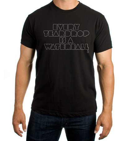
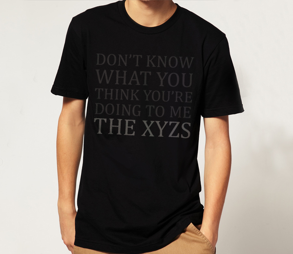
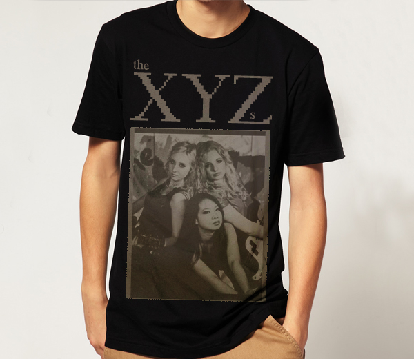
We started with basic t-shirts with our logo on, creating a clear brand image - people would recognise the logo. We then created a 'Stripper tour' t-shirt, a souvenir appealing to those who will go on our tour and want to remember the day. The next was a t-shirt with a black and white photo of us, as people often like to see the band they are a fan of. We also created some lyrics t-shirts with lines from our song that we thought sound good on a t-shirt - "I am a voyeur" and "Don't touch the girls". Our personal favourites are the more creative 'XYZ' t-shirts, with the gold writing and and pink and black alphabet versions, as they are nice even as standard t-shirts that you might find in any shop, but they also represent our band.


Not wanting to discriminate, we also decided to create a smaller range of men's t-shirts. As our band is quite girly, we wanted cool, masculine t-shirts that males wouldn't be embarrassed to wear. The top-selling music shirts and hoodies on play.com were in fact Men's, mainly rock bands, proving that men do wear band merchandise, not just teenage girls (though One Direction were unsurprisingly close behind!)

We took inspiration from band merchandise like Kings of Leon and Coldplay, bands popular with men as well as women.


First of all we designed women's t-shirts, taking inspiration from other bands' merchandise and creating clothing that we ourselves would like to wear. We looked at several artists' clothing stores popular with young women:


Not wanting to discriminate, we also decided to create a smaller range of men's t-shirts. As our band is quite girly, we wanted cool, masculine t-shirts that males wouldn't be embarrassed to wear. The top-selling music shirts and hoodies on play.com were in fact Men's, mainly rock bands, proving that men do wear band merchandise, not just teenage girls (though One Direction were unsurprisingly close behind!)

We took inspiration from band merchandise like Kings of Leon and Coldplay, bands popular with men as well as women.

T-shirts were prominently black or grey with dark, simple designs. We liked the idea of lyrics in a subtle font, like Coldplay's, and a sepia print of the band. Basing our designs on these ideas, a black and white version of our classic logo tee, we created our men's range:


From experience and looking at other bands' websites we came up with the price of £15 for t-shirts, as our site is the only place for new, official merchandise, so if a fan really wants one, they have no choice but to buy it from there so they will. After Christmas we would probably have a January sale, slashing the price of some of the lowest-selling t-shirts in order to make room for new designs which would coincide with our next singles.
Finally we came up with some accessories. We knew that calendars were popular with teenagers around Christmas time, favouring ones of their favourite celebrities and bands.

Some of the most popular calendars on play.com at the moment are One Direction, Olly Murs and JLS, all artists with mainly young female fans, plus Breaking Dawn which also has the same core market, suggesting that teenage girls are large calendar buyers/receivers as gifts.

We also designed some posters, as we know from experience that teenagers love to cover their walls in posters of their favourite artists. Yet again the top selling posters online include One Direction, JLS and The Wanted, re-iterating this fact.


Some other merchandise included bags and a wristband, a great souvenir for a fan who has attended one of our concerts.


Saturday, November 26, 2011
Group Meeting 25/11/11
One week ahead of our production deadline, we made a to-do list to make sure we got everything done in time. This was the list of tasks we wanted to achieve before the weekend. We stuck it on our edit suite wall and ticked things off as we went along, so all three group members were constantly up to date with tasks.

Tuesday, November 22, 2011
Behind The Scenes Video
We made a short video from behind-the-scenes footage from our shoots to post on our band website:
Sunday, November 20, 2011
Utilising Social Networks
As part of our website and promotional material, we decided to create a Twitter page for our band:

We stuck to our website colour scheme, using our logo as the background, to keep a strong brand image across all the advertising platforms. Each of us also made individual member Twitters too, as most bands have an official band Twitter plus personal member pages to tweet from as well, as fans can follow their favourite members, interact with them and feel much more involved in their lives, which we believe is the key to a strong fanbase.
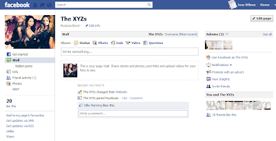
We also made a Facebook page for our friends to 'like':
And a Tumblr page, a blogging/social network site popular with teenagers and music fans, who of course we are specifically targeting. Again we used the same black/white/pink colour scheme, and Odelia designed a layout for the page. We posted some photos from our music video shoots to make it look authentic.

These platforms are all integrated into our official website which is the hub of our online presence and the centre of our marketing campaign where all these different links come together, allowing "fans" to interact with and feel involved in the band in as many different ways as possible.

We stuck to our website colour scheme, using our logo as the background, to keep a strong brand image across all the advertising platforms. Each of us also made individual member Twitters too, as most bands have an official band Twitter plus personal member pages to tweet from as well, as fans can follow their favourite members, interact with them and feel much more involved in their lives, which we believe is the key to a strong fanbase.
We also made a Facebook page for our friends to 'like':

And a Tumblr page, a blogging/social network site popular with teenagers and music fans, who of course we are specifically targeting. Again we used the same black/white/pink colour scheme, and Odelia designed a layout for the page. We posted some photos from our music video shoots to make it look authentic.

These platforms are all integrated into our official website which is the hub of our online presence and the centre of our marketing campaign where all these different links come together, allowing "fans" to interact with and feel involved in the band in as many different ways as possible.
Friday, November 18, 2011
Photoshoot
Yesterday we had a photoshoot for our album cover. We dressed and styled ourselves differently to the video to show diversity, and decided to go for the more classic look, similar to the Glamour photograph shown in the previous post. We photographed each other for the solo shots and enlisted the help of Chris, our technician, and Eoin, a fellow media student, to take the group shots, though of course we directed ourselves.
Here are some of our favourite shots after editing in Photoshop:


Here are some of our favourite shots after editing in Photoshop:
Thursday, November 17, 2011
Photoshoot Inspiration
As we are shooting our album artwork tomorrow, we decided to look at some of our favourite magazine photoshoots from the past few years for inspiration.

One of our ideas came from this shot of The Vampire Diaries cast for Rolling Stone. We liked the idea of using a rope and tangling it around us, as it shows a unity between the band members, but also shows that we aren't such a 'clean cut' girlband, and have a fun and rough side. We thought that we could recreate a photo similar to this as there are three of us in the band, and this could give us a theme for our album, perhaps calling the album something similar to 'Tangled Up', but not actually 'Tangled Up' as this is the name of one of Girls Aloud's albums.
Another photo we really liked which we thought we could get inspiration was this photo of The Saturdays, from their photoshoot in Fabulous Magazine.


Another idea we quite liked was the use of mirrors, as seen in this photoshoot of Leighton Meester and Blake Lively from Gossip Girl, for Entertainment Weekly.


One of our ideas came from this shot of The Vampire Diaries cast for Rolling Stone. We liked the idea of using a rope and tangling it around us, as it shows a unity between the band members, but also shows that we aren't such a 'clean cut' girlband, and have a fun and rough side. We thought that we could recreate a photo similar to this as there are three of us in the band, and this could give us a theme for our album, perhaps calling the album something similar to 'Tangled Up', but not actually 'Tangled Up' as this is the name of one of Girls Aloud's albums.
Another photo we really liked which we thought we could get inspiration was this photo of The Saturdays, from their photoshoot in Fabulous Magazine.
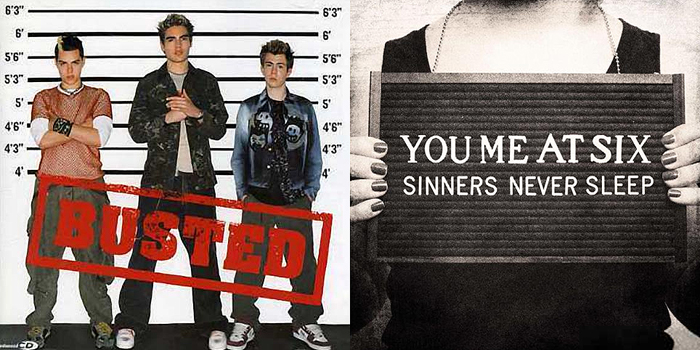
We liked this idea as again it would show us as a more rockier, rebellious band, and would work well with our current black/white/pink colour scheme. However, instead of holding police signs like the girls in this photo, we could hold three signs saying 'X', 'Y' and 'Z', emphasising the branding of our band. Again, similar to the first idea, this could give us a theme for our album, calling it something along the lines of police, jail or rebellion.
However, after discussing this idea we realised that we didn't want to do this as quite a few artists have already had the police idea as their front cover, such as Busted and You Me At Six.

In the pictures we can see one of the girls writing on the mirror in lipstick, and we thought we could recreate something like that for our album cover, perhaps with the name of the album written on the mirror. This would carry on our branding as the logo for The XYZs is a pink scribble which looks similar to a lipstick mark. We thought that this could be a really nice idea as on our shoot day we took a few mirror shots, which we all liked.
Another photoshoot we looked at was Kristen Stewart for Interview Magazine, as we thought the photos for this shoot were really different and striking. In particular we looked at these two shots, where Kristen is seen with ripped paper and transparent plastic across her mouth. We really liked the idea of ripped paper as this gives us the edgier rough look, and it would provide us a with lot of opportunities to play around with real paper or Photoshop (i.e. using ripped paper brushes and making our album cover look like it has ripped paper edges.)

Finally, we really liked this photo of Nina Dobrev, Sara Paxton and Jessica Lucas from Glamour Magazine, which is much more simple, classic and glamourous than the others. This photo just shows the three girls sitting down in outfits of the same colour; something we can easily recreate, and make look professionally taken. We really liked how the girls were positioned so that their faces were all on different levels, and the fact that they are placed against a plain contrasting background means all of our focuses are just on them.
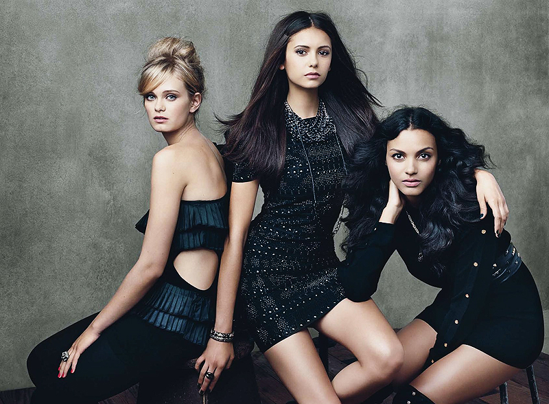
After discussing all of the options, we decided that the last idea would probably be the best idea, as it would show us in a more classic and glamorous light, contrasting from the painter outfits we wore for our video for Stripper. This would also be the easiest to take and the easiest idea to make look effective and professional, something we can use for a front cover. At school we also have plain backdrops which we can use to take photos with, making this idea the most practical too.
Subscribe to:
Posts (Atom)