Monday, November 28, 2011

Merchandise

For our band's website we created a selection of merchandise for fans to "buy".
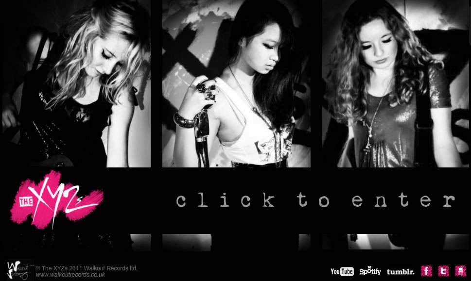
First of all we designed women's t-shirts, taking inspiration from other bands' merchandise and creating clothing that we ourselves would like to wear. We looked at several artists' clothing stores popular with young women:


We started with basic t-shirts with our logo on, creating a clear brand image - people would recognise the logo. We then created a 'Stripper tour' t-shirt, a souvenir appealing to those who will go on our tour and want to remember the day. The next was a t-shirt with a black and white photo of us, as people often like to see the band they are a fan of. We also created some lyrics t-shirts with lines from our song that we thought sound good on a t-shirt - "I am a voyeur" and "Don't touch the girls". Our personal favourites are the more creative 'XYZ' t-shirts, with the gold writing and and pink and black alphabet versions, as they are nice even as standard t-shirts that you might find in any shop, but they also represent our band.


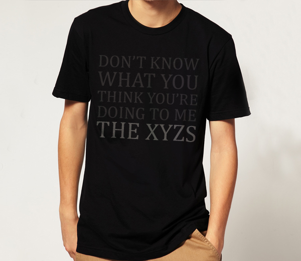
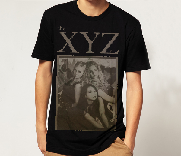
Not wanting to discriminate, we also decided to create a smaller range of men's t-shirts. As our band is quite girly, we wanted cool, masculine t-shirts that males wouldn't be embarrassed to wear. The top-selling music shirts and hoodies on play.com were in fact Men's, mainly rock bands, proving that men do wear band merchandise, not just teenage girls (though One Direction were unsurprisingly close behind!)


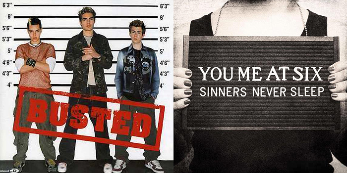
We took inspiration from band merchandise like Kings of Leon and Coldplay, bands popular with men as well as women.

T-shirts were prominently black or grey with dark, simple designs. We liked the idea of lyrics in a subtle font, like Coldplay's, and a sepia print of the band. Basing our designs on these ideas, a black and white version of our classic logo tee, we created our men's range:

From experience and looking at other bands' websites we came up with the price of £15 for t-shirts, as our site is the only place for new, official merchandise, so if a fan really wants one, they have no choice but to buy it from there so they will. After Christmas we would probably have a January sale, slashing the price of some of the lowest-selling t-shirts in order to make room for new designs which would coincide with our next singles.

Finally we came up with some accessories. We knew that calendars were popular with teenagers around Christmas time, favouring ones of their favourite celebrities and bands.

Some of the most popular calendars on play.com at the moment are One Direction, Olly Murs and JLS, all artists with mainly young female fans, plus Breaking Dawn which also has the same core market, suggesting that teenage girls are large calendar buyers/receivers as gifts.

 We also designed some posters, as we know from experience that teenagers love to cover their walls in posters of their favourite artists. Yet again the top selling posters online include One Direction, JLS and The Wanted, re-iterating this fact.
 Some other merchandise included bags and a wristband, a great souvenir for a fan who has attended one of our concerts.


Saturday, November 26, 2011

Group Meeting 25/11/11

One week ahead of our production deadline, we made a to-do list to make sure we got everything done in time. This was the list of tasks we wanted to achieve before the weekend. We stuck it on our edit suite wall and ticked things off as we went along, so all three group members were constantly up to date with tasks. 

Tuesday, November 22, 2011

Behind The Scenes Video

We made a short video from behind-the-scenes footage from our shoots to post on our band website:


Sunday, November 20, 2011

Utilising Social Networks

As part of our website and promotional material, we decided to create a Twitter page for our band:


We stuck to our website colour scheme, using our logo as the background, to keep a strong brand image across all the advertising platforms. Each of us also made individual member Twitters too, as most bands have an official band Twitter plus personal member pages to tweet from as well, as fans can follow their favourite members, interact with them and feel much more involved in their lives, which we believe is the key to a strong fanbase.

We also made a Facebook page for our friends to 'like':


And a Tumblr page, a blogging/social network site popular with teenagers and music fans, who of course we are specifically targeting. Again we used the same black/white/pink colour scheme, and Odelia designed a layout for the page. We posted some photos from our music video shoots to make it look authentic.


These platforms are all integrated into our official website which is the hub of our online presence and the centre of our marketing campaign where all these different links come together, allowing "fans" to interact with and feel involved in the band in as many different ways as possible.

Friday, November 18, 2011

Photoshoot

Yesterday we had a photoshoot for our album cover. We dressed and styled ourselves differently to the video to show diversity, and decided to go for the more classic look, similar to the Glamour photograph shown in the previous post. We photographed each other for the solo shots and enlisted the help of Chris, our technician, and Eoin, a fellow media student, to take the group shots, though of course we directed ourselves.

Here are some of our favourite shots after editing in Photoshop:

Thursday, November 17, 2011

Photoshoot Inspiration

As we are shooting our album artwork tomorrow, we decided to look at some of our favourite magazine photoshoots from the past few years for inspiration.


One of our ideas came from this shot of The Vampire Diaries cast for Rolling Stone. We liked the idea of using a rope and tangling it around us, as it shows a unity between the band members, but also shows that we aren't such a 'clean cut' girlband, and have a fun and rough side. We thought that we could recreate a photo similar to this as there are three of us in the band, and this could give us a theme for our album, perhaps calling the album something similar to 'Tangled Up', but not actually 'Tangled Up' as this is the name of one of Girls Aloud's albums.

Another photo we really liked which we thought we could get inspiration was this photo of The Saturdays, from their photoshoot in Fabulous Magazine.


We liked this idea as again it would show us as a more rockier, rebellious band, and would work well with our current black/white/pink colour scheme. However, instead of holding police signs like the girls in this photo, we could hold three signs saying 'X', 'Y' and 'Z', emphasising the branding of our band. Again, similar to the first idea, this could give us a theme for our album, calling it something along the lines of police, jail or rebellion.
However, after discussing this idea we realised that we didn't want to do this as quite a few artists have already had the police idea as their front cover, such as Busted and You Me At Six.


Another idea we quite liked was the use of mirrors, as seen in this photoshoot of Leighton Meester and Blake Lively from Gossip Girl, for Entertainment Weekly.


In the pictures we can see one of the girls writing on the mirror in lipstick, and we thought we could recreate something like that for our album cover, perhaps with the name of the album written on the mirror. This would carry on our branding as the logo for The XYZs is a pink scribble which looks similar to a lipstick mark. We thought that this could be a really nice idea as on our shoot day we took a few mirror shots, which we all liked.


Another photoshoot we looked at was Kristen Stewart for Interview Magazine, as we thought the photos for this shoot were really different and striking. In particular we looked at these two shots, where Kristen is seen with ripped paper and transparent plastic across her mouth. We really liked the idea of ripped paper as this gives us the edgier rough look, and it would provide us a with lot of opportunities to play around with real paper or Photoshop (i.e. using ripped paper brushes and making our album cover look like it has ripped paper edges.)


Finally, we really liked this photo of Nina Dobrev, Sara Paxton and Jessica Lucas from Glamour Magazine, which is much more simple, classic and glamourous than the others. This photo just shows the three girls sitting down in outfits of the same colour; something we can easily recreate, and make look professionally taken. We really liked how the girls were positioned so that their faces were all on different levels, and the fact that they are placed against a plain contrasting background means all of our focuses are just on them. 


After discussing all of the options, we decided that the last idea would probably be the best idea, as it would show us in a more classic and glamorous light, contrasting from the painter outfits we wore for our video for Stripper. This would also be the easiest to take and the easiest idea to make look effective and professional, something we can use for a front cover. At school we also have plain backdrops which we can use to take photos with, making this idea the most practical too.

Wednesday, November 16, 2011

Record Label

We have created a fictional record label for our new band to be signed to called Walkout Records.


It is a sub-division of Island Records, a large record company which is owned by Universal Music Group, a huge global conglomerate and biggest record company in the world.


In America Island is part of The Island Def Jam Motown Music Group in the United States as a rock-based record company, and as a standalone company in the UK. So although Walkout Records is a small British label, it has financial backing and stability from Universal. This means that we have the reputation of being signed to a new, unknown homegrown label, making us seem very British and down-to-earth (some bands are accused of "selling out" when they sign to a large label) but Universal gives us more funding and opportunities than an indie label.

Tuesday, November 15, 2011

Group Meeting 15/11/11

We met as a group to discuss this week's targets.

After our successful performance re-shoot, we now have all the footage we need for the music video.
We now need to book a photo shoot for our promo photos and album cover photos. We decided this would be Thursday the 17th, periods 4+5 and lunchtime if we need it.
This was fine with the teachers and technician, so we went ahead to book the slot.

After some discussion with our teacher, we decided that as we already have so many photos on set with instruments and glam-rock styling, we should go a bit more sophisticated and classic for this shoot, so we have decided to dress in black, gold and silver with red lips, so we all have similar styling.

We also decided on some targets we wanted to meet by mid next week, so by our lesson on the 23rd:
  • Finish website completely
  • Rough cut of music video
  • Plan title and song names for album
  • Have rough album cover finished
  • Make record label logo

After taking a look at our website so far, our teacher gave us suggestions to improve it:
  • Add a competition, aimed at women/girls
  • Add a forum/comments page for more interactivity
  • Downloadable wallpapers
  • Make song available to download as a ringtone

Monday, November 7, 2011

Re-Shoot

After viewing our footage after the half term shoots, we were extremely pleased with the narrative footage. However, we realised that throughout the performance, we had some framing issues as we did not realise that our backdrop was too low down, resulting in an ugly dark blue strip and parts of the ceiling were viewable in nearly all of the close-up shots, distracting from us and slightly ruining the beauty shots.

We looked at ways of correcting this in post-production, such as colour-grading and black and white conversion, but after some discussion with our technician, he said that it would be difficult to completely solve the problem, so we decided a re-shoot would be the best option. All the painting narrative is great to use, but we will be re-shooting the performance this Thursday at the school Seward Studio, which was our original plan, as it will be easier to light and frame our shots there and wouldn't mean having to set up the garage all over again.


We have booked the studio for most of the day, from 11am to 5.30pm, so we should be able to film everything in this slot.

Friday, November 4, 2011

Ceiling Issues

After our 2 day shoot in half term we captured the footage and began editing. We were very pleased with our narrative footage, however in the performance shots our band logo was not directly behind the band as we had intended. As the garage we were filming in had a low ceiling it was impossible to film any high angle shots and due to space the composition of shots would always included the grotty ceiling. Not exactly an ideal way to sell an aspirational girl band. We experimented with treating the video so that the ceiling issues were minimised and looked to this tutorial on Creative Cow to hopefully solve the problem.


Advanced Titler & Feathering a Track Matte as a Mask using Adobe Premiere Pro CS5.5

However this would have been very time consuming and highly complicated- we would have had to edit each frame indvidually. After much discussion with our technician and teachers we decided it was probably a good idea to reshoot. Going back to our original idea of having two separate set ups, we decided to film in our school's Seward Studio, allowing us complete control over lighting, space and angles and composition of shots as there was nothing obstructing it.


Watch some of our original footage in this video here: